One operating system
The top-left corner is the dependable foundation: one calm place from which a business is run.
YionStack brand
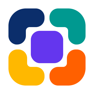
Four corners. One core. The YionStack mark expresses a business operating as one connected system—every module distinct, every signal shared, and YionAI working across the whole.
The idea
The pieces keep their own character, but their spacing and alignment make them read as one. That is YionStack: specialised capabilities without separate systems.
The top-left corner is the dependable foundation: one calm place from which a business is run.
The top-right corner is YionAI observing the whole business, connecting signals and acting with context.
Yellow brings optimism and momentum: clearer decisions, fewer seams and room to grow confidently.
The bottom-right corner is the outcome: the module that turns connected information into finished work.
Why our logo matters
Every part of the mark carries a meaning we can be held to. If the product ever stopped working the way the logo describes, the logo would be the thing that was wrong.
The outer forms
Finance. People. Customers. Operations. Projects. Communication. Education. Commerce. Every organisation weighs them differently, and the four forms stand for all of them rather than for any four in particular.
Each keeps its own shape. Each has its own responsibility. Not one of them exists alone — look at where they point.
The centre
Business identity. Trusted data. Permissions. Automation. Knowledge. Artificial intelligence. Context. The shared operating core that every capability reads from and writes to.
Take the centre away and the corners are four pieces of isolated software. Put it back and they are one operating system. That is the entire argument of this company, drawn at 16 pixels.
Read why we believe thisEverything revolves around the core.
One connected system
Every corner connects to it. Information does not stop at a module boundary; it flows through the one operating system at the centre and returns as action.
Logo system
Use the full lockup when space allows, the mark for compact product surfaces, and the reversed treatment on dark backgrounds.
Primary lockup

Icon only
Dark surface
App icon
Colour
Navy carries confidence; teal carries intelligence; amber and orange bring momentum and completion. Violet is the core they all connect to — and it is the product’s own primary, so the mark and the interface are literally the same colour. The wordmark uses only these two: violet for Yion, navy for Stack. Slate supports long-form communication.
Foundation Navy
#0B2E6B
Intelligent Teal
#009990
Growth Amber
#FFB800
Action Orange
#FF6000
YionStack Violet
#6436EE
Slate
#64748B
Clear space
Keep clear space around the mark equal to the width of one inner gap. Never crowd it with text, borders or another logo.
Minimum size
Use the mark at 16px or larger digitally. Below 32px, use the icon alone and keep the approved internal spacing intact.
The promise
The mark is a reminder of what the product must always deliver: one source of truth, shared intelligence and real work completed across the whole business.